As a business, your main objective of sending out emails must be to sell your products, market your services, create brand awareness or provide information to your customers. The key to achieving your email marketing goals is to have a luring subject line to get your emails opened, a strong offer or content to keep the users hooked, and a clear call-to-action to get them to click through.
A call-to-action is one of the most important and often ignored elements of your email. It is the gateway to get more users on your webpage or app and improve conversions. Whether your email is a sales email, welcome email, cart abandonment email, or promotional email, it should lead to final conversion. And, to lead your subscribers to your online store, web page, or app, you need to have a CTA that is compelling enough for users to click.
Everything, right from the placement of the CTA, its size, the design and the message matters in getting people to click on it. To begin with, designing perfect emails and CTAs, you can choose from a range of Mailchimp email templates, Pardot templates or Salesforce templates.
Let us go through the best practices to create high-converting calls-to-action for your emails.
1. Make it Personal
Your subscribers receive hundreds of sales emails in their inbox, and to make a mark, your email must feel personal. The copy and CTA should look like a one-to-one conversation between your brand and the subscriber. Choose the right words and colours to create an impactful and compelling copy and CTA that keeps the users engaged throughout the email. When the email speaks directly to the subscribers, they are more likely to click through.
Check out this email from Casper. It is a welcome email with an engaging copy and a supporting CTA. The text “Let’s get sleepy” is enticing and in line with the brand’s offerings.

2. Get Creative with the CTA Copy
Generally, we come across emails with common CTAs that say “Click Here”, “Submit”, and “Shop Now”. Although it depends on what action you want your users to take, there is no harm in making it creative. Using simple and actionable copy for your email CTA will persuade the users to click through. Refrain from using common words, and use convincing words that make them curious to know more about your offerings.
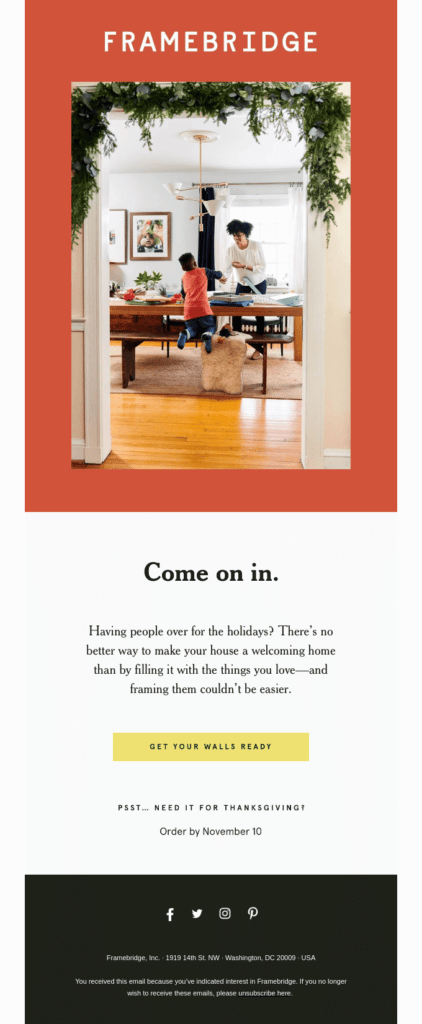
The brand Framebridge uses a first-person narrative and a welcoming tone in their holiday email. The CTA copy says “Get your walls ready”, which is more distinct and attractive than the usual “Click Here” and “Shop Now”.

3. Create Urgency
If you have exclusive offers and deals that are time-sensitive, use it in your email copy to create a sense of urgency and get people to act instantly. Time-limited deals evoke curiosity in the users and result in better engagement. It is therefore a great idea to add a countdown timer in your email or use words that depict urgency. Use trigger words like “Buy Now”, “Offer Ends”, or “Last Chance” that entice the users to click-through.
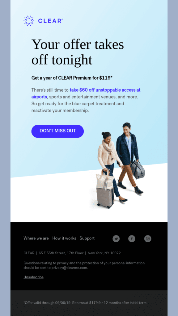
Here’s an email from Clear, which invokes urgency with their subject line, headline and CTA copy. Take a look!
Subject line: Final call: $60 off a year of CLEAR

4. Use Contrasting Colors for CTA Buttons
The visual impact of your email plays a vital role in boosting conversions. Make your email CTAs visually appealing and persuasive by using attractive colors that make them stand out from the rest of the elements in the email. Use a bright and contrasting color for the CTA button to quickly draw user attention.
For example, this email from Purple uses a distinct color for their CTA, while the rest of the email is purple-themed.

5. Make the CTA Button Big and Clickable
For your email users to click-through, your CTA should be clearly visible, big enough and easy to click. Use ample white space around the CTA button and avoid making the design look cluttered with too many design elements, text, or links. Use contrasting colors and give it a complementary border, to make it look distinctive. Moreover, since email subscribers view emails on various screens, make sure it is optimized for mobiles and other devices.
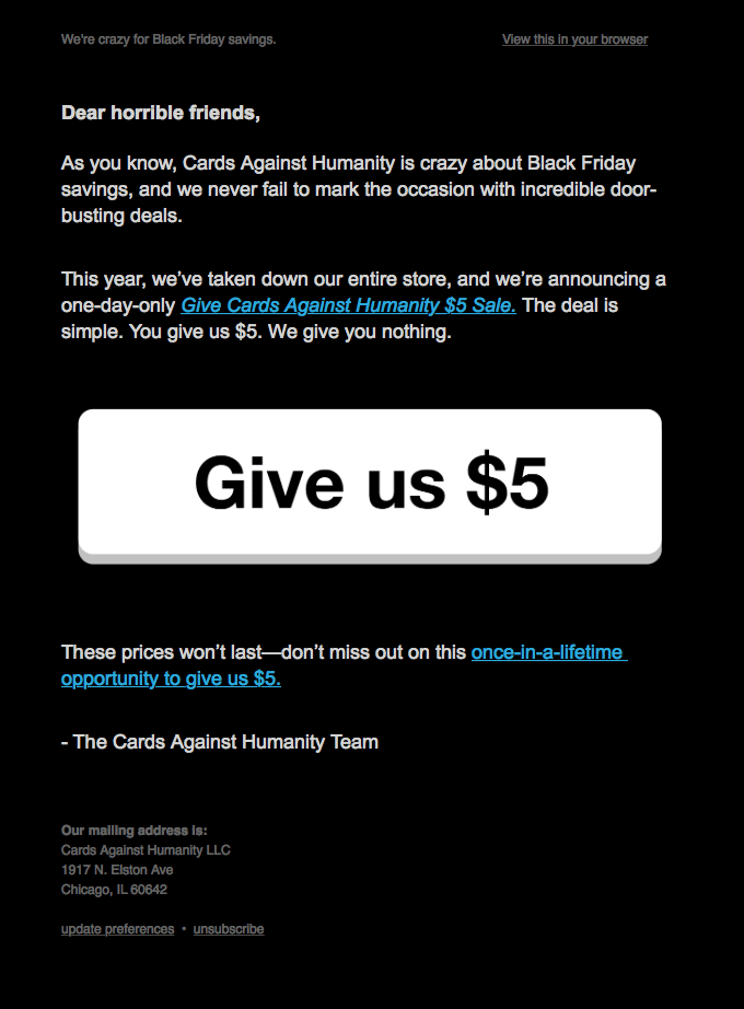
Check out this email from Cards Against Humanity. The motto behind sending the email is very clearly represented in the form of an overpowering CTA button, which is easily clickable.

Test the CTA before Sending
The CTA placement, size, copy, color, everything is important to drive the users to click. It is therefore vital to get the CTA right. Before you send the email, test various versions of the CTA to figure out which one works best in getting more conversions. A/B testing will help you know which CTA will bring maximum clicks. Make sure all the CTAs are properly linked to the right landing page for smooth user experience.
Wrapping Up
No matter what your business is, a well thought out email CTA will surely increase subscriber engagement. How you design, write and present your CTA decides whether the subscribers take action or ignore it. When done right, it can help you get more visitors to your website or landing page, boost sales and ultimately improve your ROI.
Author Bio
Kevin George is Head of Marketing at Email Uplers, one of the fastest growing custom email design and coding companies that specializes in professional email template creation and PSD to HTML email conversion; they are Mailchimp experts. Kevin loves gadgets, bikes, jazz and eats and breathes email marketing. He enjoys sharing his insights and thoughts on email marketing best practices on his blog.
