The rise of eCommerce websites is incredulous. As of today, there are approximately 12-24 million ecommerce websites worldwide. Further, the online market will dominate the estimated 95% of transactions worldwide in 2040.
Approximately 2.05B digital buyers will have made their purchases by the end of 2020. The number shows excellent prospects, so kickstarting your own eCommerce website can be the best decision you’ve ever made.
To get your eCommerce site to stand out from the competitor’s crowd, equip yours with tons of useful features. In this article, we’ll unveil seven essential eCommerce features, tips on how to do it, and examples of what it looks like on the site.
1. Clear Product and Category Navigation
Everyone fancies a user-friendly eCommerce website. Enhance your website’s User Experience (UX) by paying attention to navigation, including categorization, search bar, and sorting function.
Providing clear navigation helps your customers find their desired items easier, resulting in a faster deal. More to your advantage, it can move up your website’s rank on Google and other search engines.
Here are some tips to have easy website navigation:
- Clearly Label the Menu. Naming your menu based on the product’s category eases your consumer’s journey.
- Use a Floating Menu. As it stays put while visitors are scrolling down your site, putting this on your website helps them glide from one page to another more easily.
- Include a Search Bar. As it allows shoppers to find the products they’re looking for without exploring all the menus.
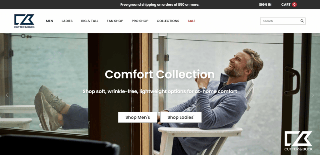
Cutter & Buck has all three: clear labeling, sticky header, and a search bar. The men and women’s section on the homepage also eases the visitors to instantly narrow down the search.
2. Easy-to-Use Cart and Checkout Process
A shopping cart icon is a must for an ecommerce site. Without it, visitors will find it harder to get to the final stage of the purchase process, especially if they’re browsing for multiple items.
Make your cart icon clearly visible for better accessibility. Apart from encouraging purchases, this little icon can also improve your conversion rate and reduce abandonment.
In terms of the checkout process, it’s tempting to ask your customers to register for an account to enable email marketing. However, it’ll add a plus point if you provide newcomers with a guest checkout page. This strategy helps build trust, resulting in them making the actual accounts.
Further, to make the checkout process more convenient for the buyers, here are things you need to put on the checkout page:
- product names,
- product thumbnails,
- price (each item and all summed up), and
- quantity.
The information serves as a confirmation for the customers before the payment takes place.
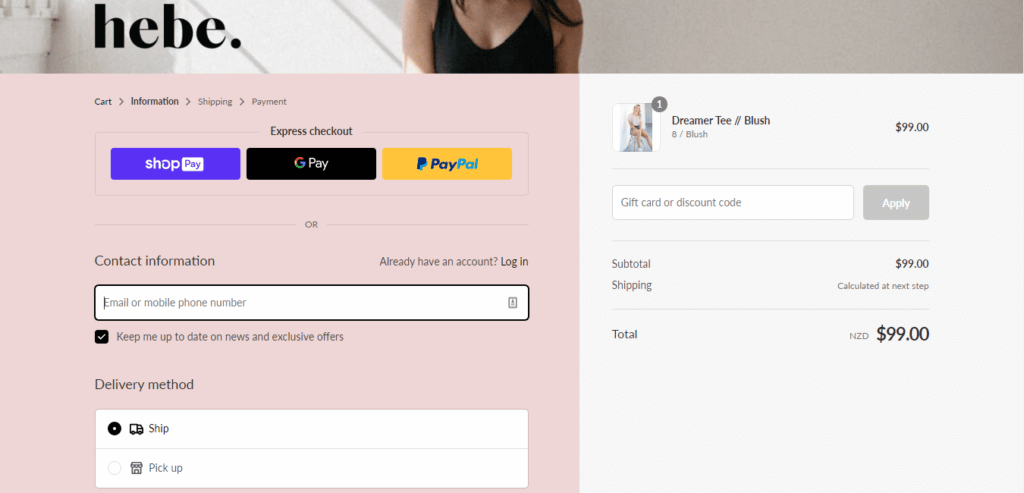
To build a responsive checkout page, get inspired by hebe. On the page, there’s the step overview from cart to payments. On the other side, it gives its customers a look in their shopping bags with all product details included.
3. Clear Prices, Shipping, Returns, and Refunds Policy
All these details relate to the expense; customers want to ensure the purchase they make worth all the money they spend.
Provide product prices and the estimated shipping cost upfront. Hiding the information contributes to a complicated checkout process and may drive your customers off. Also, a significant rise before and after shipping cost may cause irritations, resulting in abandonment.
Your returns and refunds policy also plays a vital role in your ecommerce website’s productivity. Convince your customers that they can ask for different sizes or colors, even make a refund if they’re unsatisfied with the purchases by providing a separate page explaining the policy.
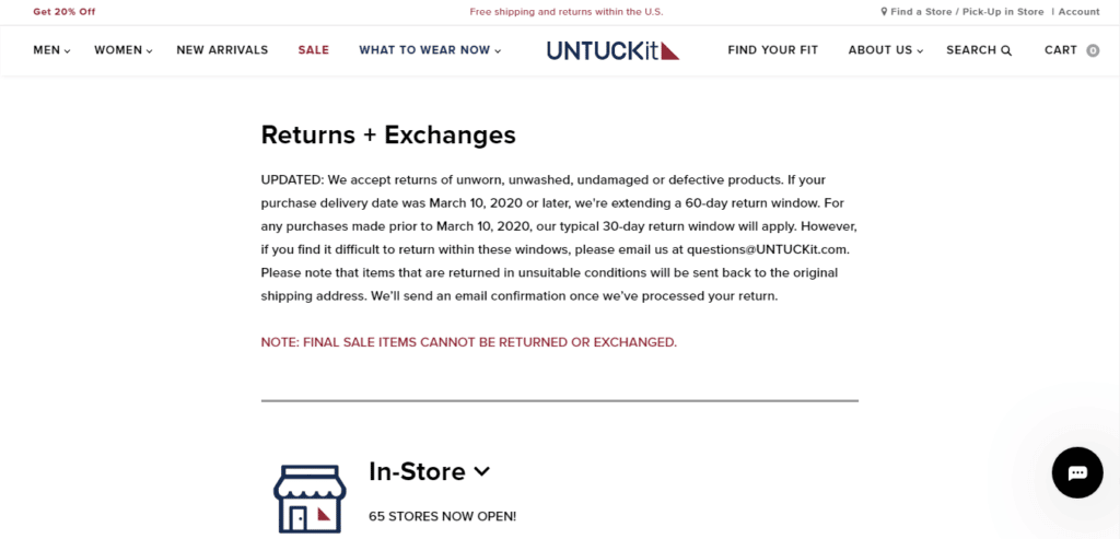
UNTUCKit’s policies are on the page footer. In the Our Policies menu, you can find explanations on the shipping, returns, and exchanges. It also presents a clickable message bar announcing discounts and free shipping and returns within the US for better accessibility.
4. Security and Trust Badges and Other Signals
It’s a common practice that a potential customer looks for e-commerce trust badges, as they show trustworthiness. Apart from the diamond-level seller badge, you also need to get your website an SSL certificate and secure payment solution.
SSL certificate allows your website to move from HTTP to an encrypted HTTPS environment. As the change is visible, your visitors will leave your site when they recognize it doesn’t have an SSL certificate. After all, sharing personal data on the internet is too risky.
Further, providing a safe and secure payment tool should also be your top priority, as this is where your customers are in the most vulnerable state. You need to reassure them that all their data remains private. PayPal and Braintree are great examples of secure payment gateways.

450GSM provides a separate page to share its customer’s privacy policy. Not only does the site have an SSL Certificate and secure payment tool, but it also dares to share with you what it uses your information for.
5. Upsell and Cross-Sell Products
Upsell refers to offering better, often larger, options of the same products to encourage the customers to buy the more expensive one. On the one hand, cross-selling refers to providing your visitors with related items to complement the products they intend to buy.
Here are some tips in kicking upselling and cross-selling:
- Don’t Be Pushy. Never bombard your customers with too many products. Awareness of their needs is key to keeping the sales flow smooth and steady.
- Offer Benefits. Whether it’s an item discount or free shipping, give the shoppers perks, as they buy more of your products.
- Conduct Follow-Ups. This can be done to show that your company cares for your customers. You can ask if they are happy with the purchase by calls or emails.
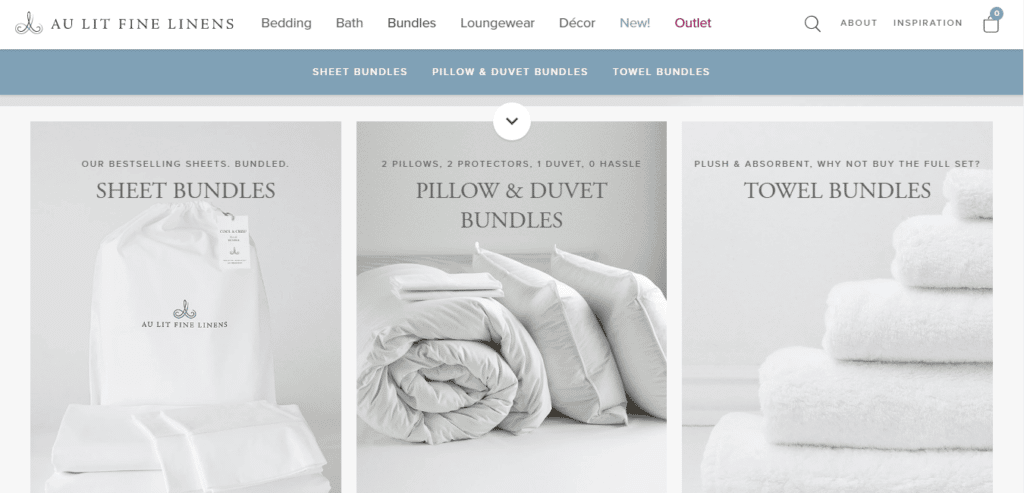
Providing bundles is a typical strategy for cross-selling. And Au Lit Fine Linens puts this into practice.
6. User-Generated Reviews and Other Signs of Social Proof
Benefit many uplifts from generating user reviews and being active on social media.
As not only can they prove your shop’s reliability and product’s quality, but they also can enhance your ecommerce site’s SEO. Not only do they improve your sales, but they also can reach a wider audience.
A study shows that 82% of customers read the user’s reviews for local businesses. They’ll read at least 10 reviews before making a purchase. Also, as much as 47% of shoppers won’t consider an ecommerce site of which stars are below 4.
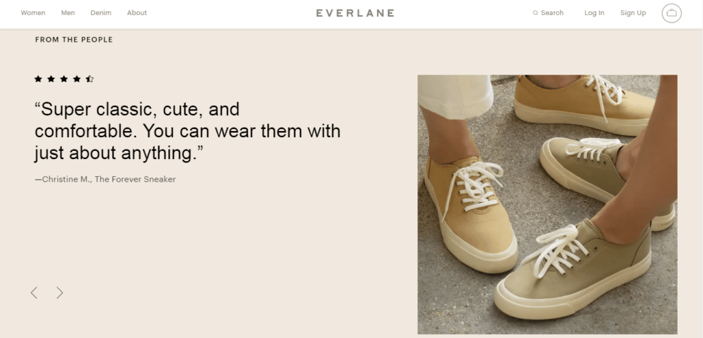
Everlane includes its customer’s reviews on the homepage. The strategy helps enhance your conversion rates. As the stars and the comments given by the happy customer contribute to proving the product’s quality.
Install review plugins to get your ecommerce site’s reviews displayed. Some notable plugins include Yelp Widget Pro, Feefoo, and the Google Places Reviews. With these functionalities, you can arrange and present your reviews to your liking.
7. FAQs and Tutorials on How to Use The Site and The Products
We can easily find help when encountering a problem in a store. However, this can’t be ideal on an ecommerce website. Therefore, providing a Frequently Asked Questions (FAQs) page is a big help for buyers to find answers to their questions.
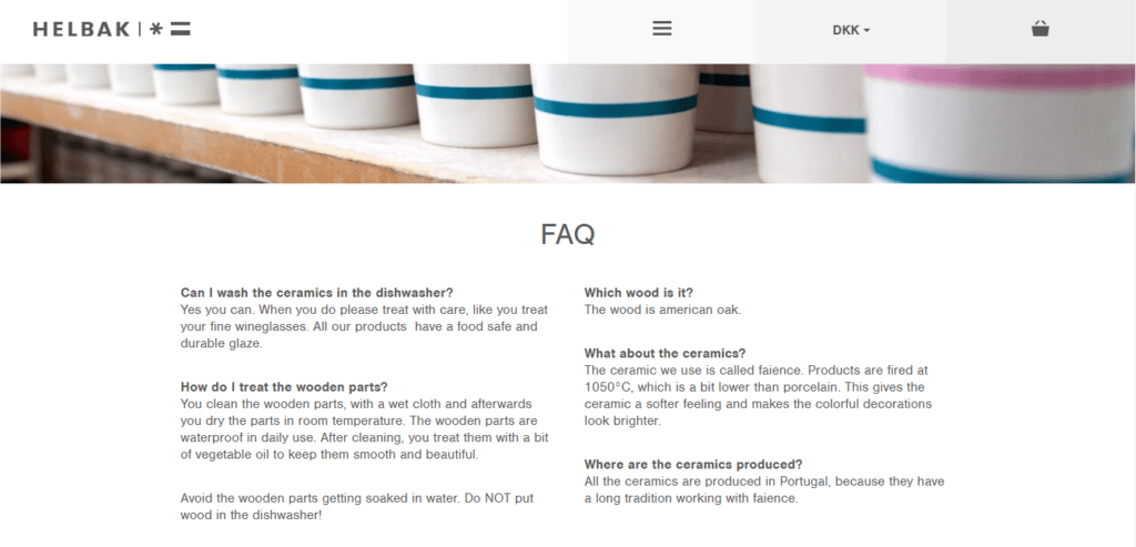
In the case with Helbak, it provides a page for the FAQs. However, you can also add a FAQ under a product description when product-related questions often pop up.
A handy tutorial on how to navigate your site is also a helpful feature. With this, users can get the confidence to explore your site with ease. And speaking of tutorials, if you sell crafted or high-tech products, including the tutorials to your website will boost its UX as well.
